Project Scope (Design)
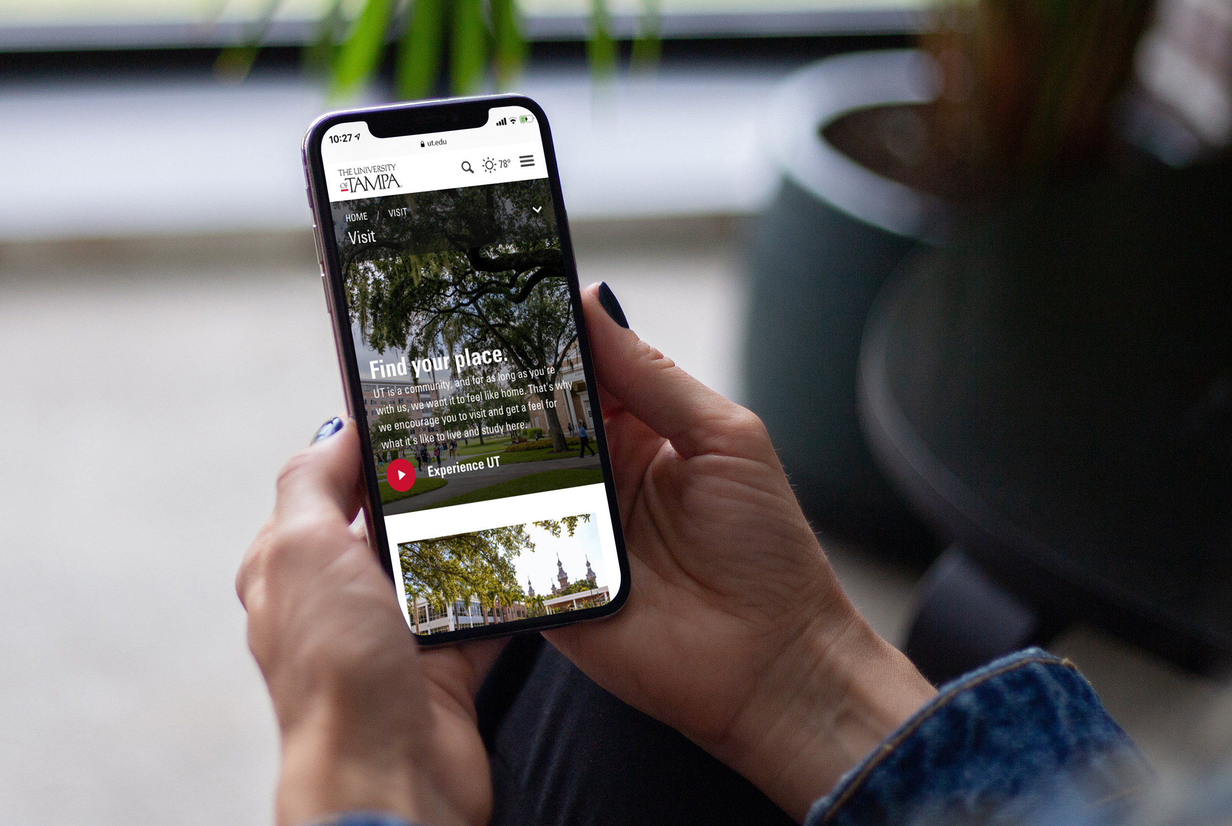
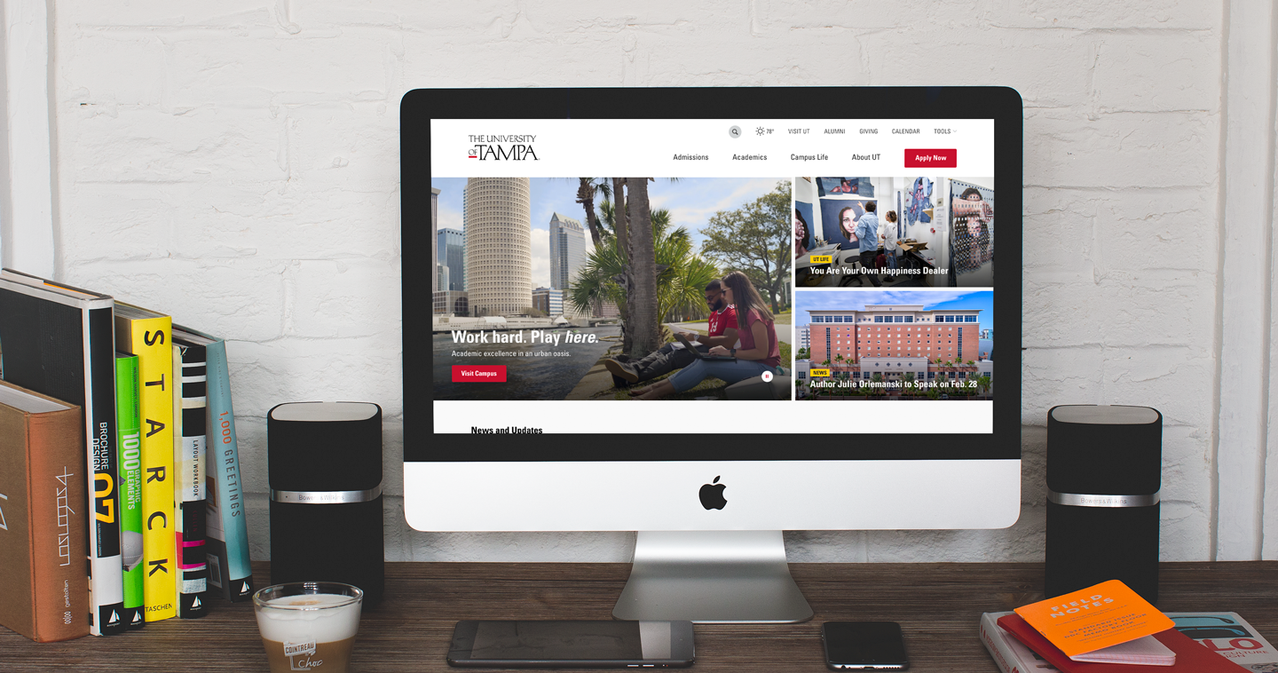
A responsive, modular, and mobile-focused framework. Consulted on site architecture and content strategy.
My Role
I was responsible for the redesign and recreation of the design system used to construct the web presence for ut.edu. I proudly represented Big Sea and led the design efforts alongside the University of Tampa’s development partner throughout the cycle of the project (kickoff to launch). I conducted all internal stakeholder presentations, principle design presentations to UT, and facilitated the handoff to the development partner.
Specifications
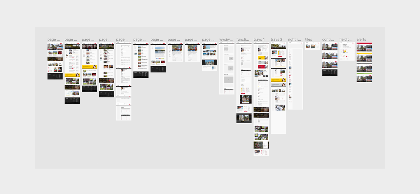
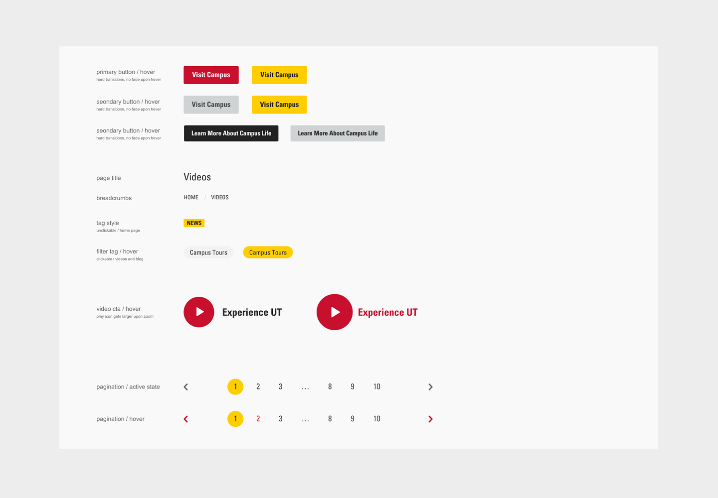
We needed to properly transition content from an outdated framework into a new, modern CMS. This required the fully accounted redesign of every module on a 155 page spec sheet—at desktop, tablet, and mobile resolutions.
Research & Analysis
The website was sorely outdated and needed a full refresh. In order to plan a clear path forward, it was critical that we fully considered how UT’s audience would engage with media and events.
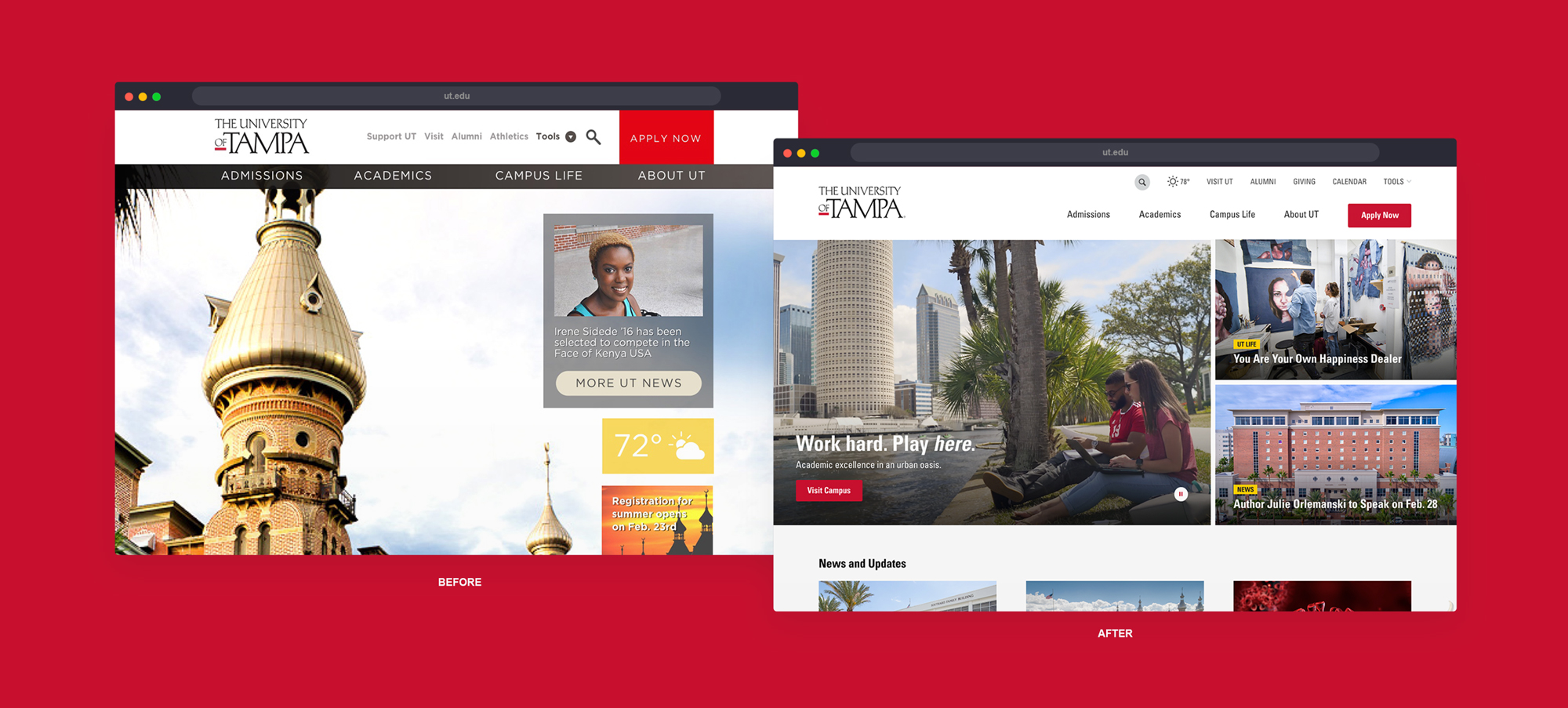
We conducted competitive research, hosted workshops with UT’s marketing and communications team, and visited campus to understand what set UT apart from other higher ed institutions. With the needs of UT’s users in mind, we revisited the site’s IA and proposed structural revisions that allowed consuming key information much easier.
The Design Strategy
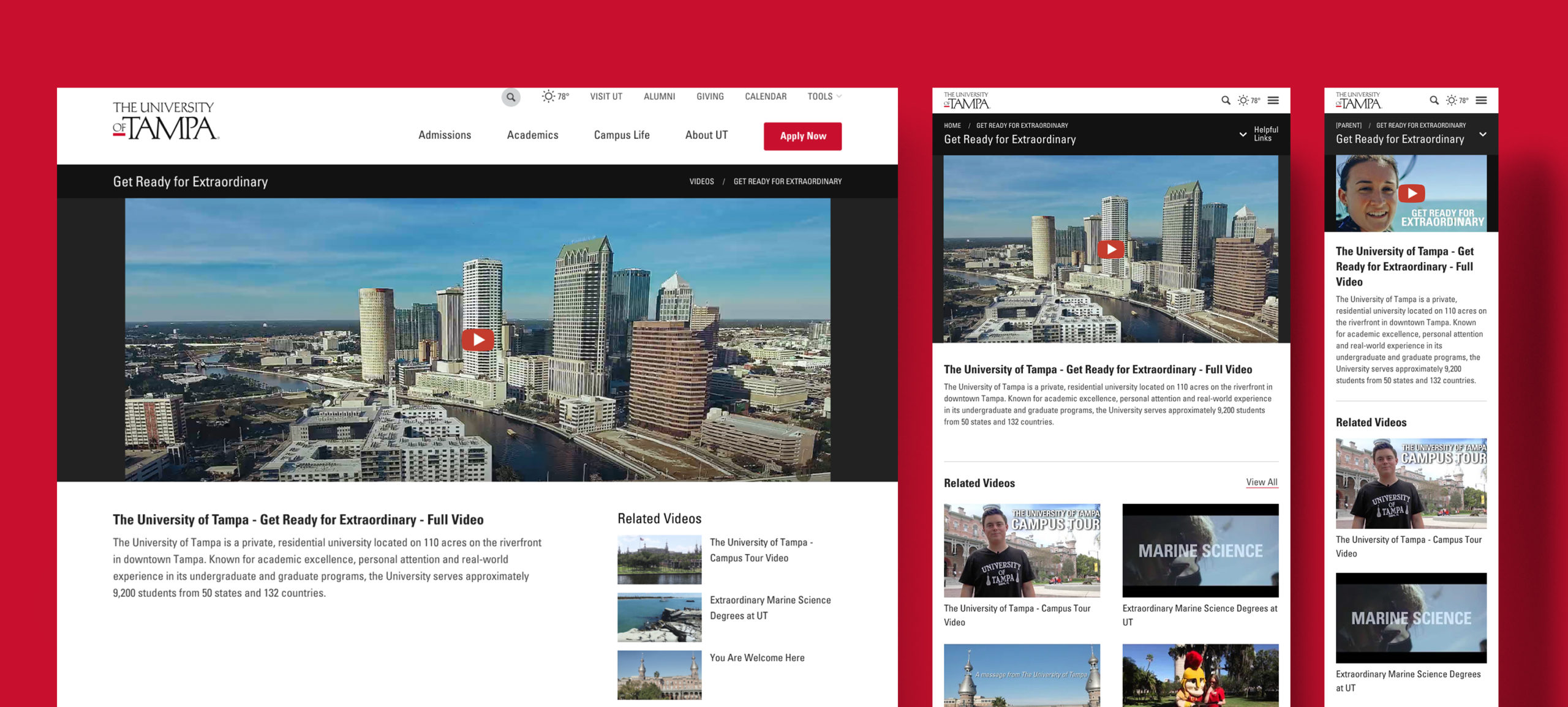
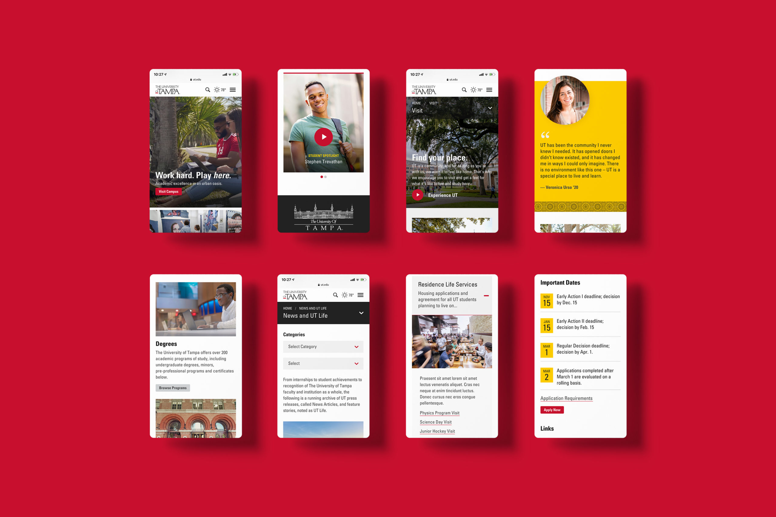
Because the success of the project hinged on how the existing and any new content would play together, we took a modular approach and ensured that every facet of the design system was designed and tested across all resolutions, particularly mobile. In addition, we had to design interworking parts that gave UT’s staff the freedom and flexibility to update the site frequently while retaining elegance and usability.
The Results
We organized and redesigned the UT web experience to better share their story and make it easier for their audiences to learn and explore. We also updated the 155 page implementation specification with all the updated UI components.
At the time this was written, UT had experienced a significant increase in traffic and page views since the new website launched (3 months).
Project Credits
Agency: Big Sea; Rich Lim: Principle Design; Ingeniux: Development; Maria Mora: Content Strategy; Kristen Quinley: Account Management
Designed: 2020
